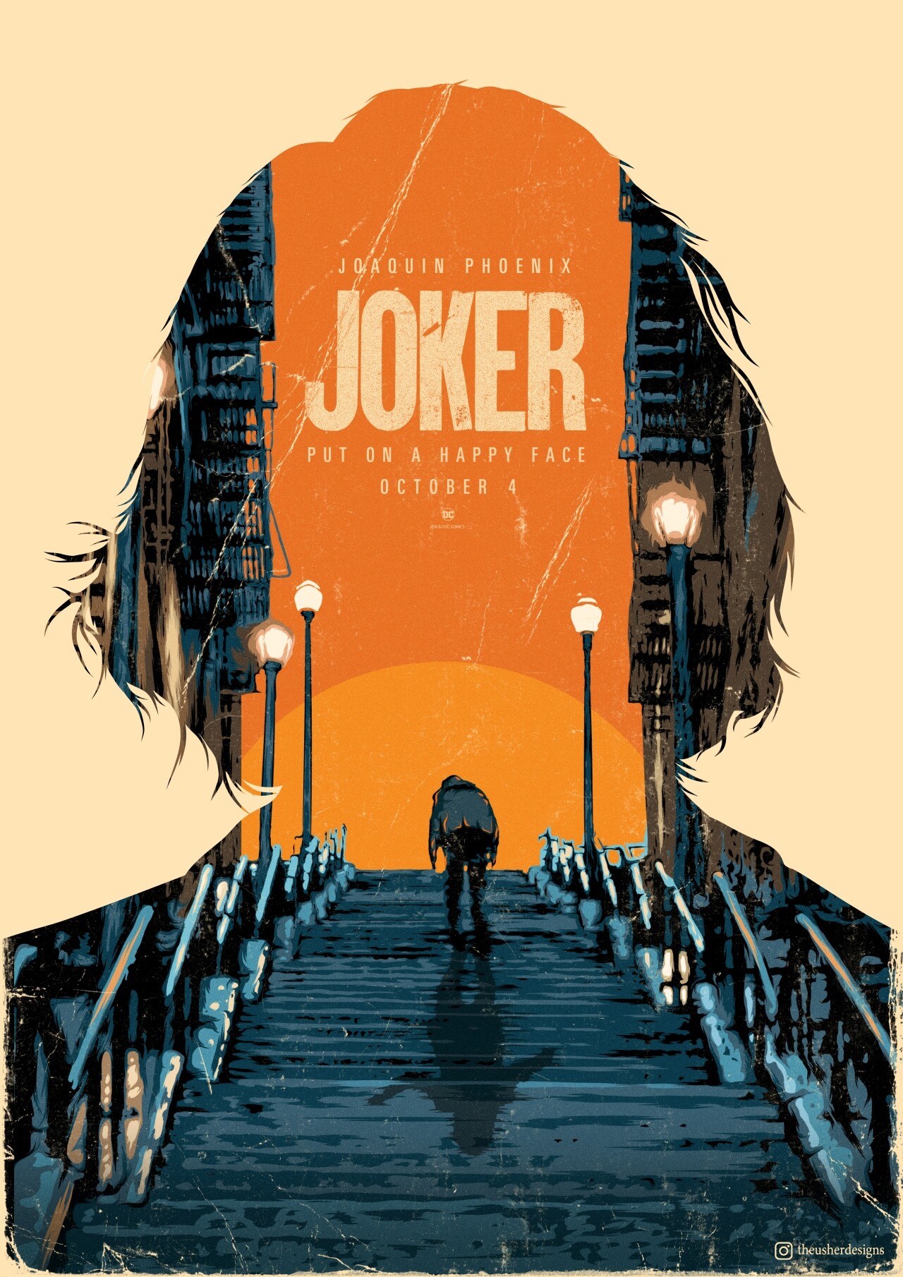
For this task I chose a poster by
Sorin Ilie
(Graphic Designer).This is an illustrated movie poster for the
world-famous blockbuster "Joker" by Todd Phillips with Joaquin Phoenix
in the lead role.
The original poster shows the legendary dance scene of the film, in
which Arthur Fleck (Joaquin Phoenix) rises and exits like the phoenix
from the ashes or from his sad victim role and changes dancing into his
new life as a brutal and misunderstood "Joker".
Idea & conception
poster becomes website
For the implementation of the website I wanted to bring this scene to
life by using a parllax scroll effect to slowly let the sun disappear
behind the canyon and the stairs, thus reflecting the gloomy mood of the
poster.
The idea was to stage the website as a kind of lead story or
announcement or trailer for the film.

The original poster works with a strong contrast of bright and
oppressive colors and thus reflects the dark, threatening atmosphere
that runs through the entire film. So it was important to me to use
these color palettes as well. I also used the silhouette of the original
poster.
Here you can see my concept for the website:

The idea behind the concept was that the viewer would be led down the
stairs when scrolling and would receive information about the film, the
story and characters or actors, as well as a small picture gallery and a
trailer. The website ends at the foot of the stairs, in mountains of
rubbish (also an important aspect of the film).

For the final implementation, however, I decided (for reasons of time,
among other things) to remove these "additional" components and only
take over the elements contained on the original poster. Which resulted
in a simple but expressive design.
Implementation
and difficulties
I programmed the silhouette in the foreground in such a way that it
recognizes whether the website is being viewed on a high or wide screen
and adapts to the height and width of the page accordingly. City /
stairs, sun and headline also adapt.

The main difficulty was to program the individual elements so that they
lie on top of each other and the sun, when scrolling, disappears between
the background and the stairs. The silhouette in the foreground also
turns out to be a hurdle, as two different silhouettes with different
spacing to the browser window have to be loaded for use in high and wide
screen.


